Wednesday, May 3, 2017

Final Portfolio

My final portfolio is a combination of all my works that I have created throughout the course of the spring 2017 semester. Overall, I had a great time in the course and I thought Professor Corrigan was very helpful. For an 8a.m. class I have never been happier, we were allowed to work at our own speed which helps a lot because I am not the best with design work. This class showed me how to do basic work in multiple different programs and since then I have been able to use my tools for work outside of the classroom. Thank you for a great semester!


Monday, April 17, 2017

Project 3: Collage

For Project 3, I created an image for Notorious B.I.G. aka Biggie Smalls song "Hypnotized". I picked the lyrics, "Miami, DC prefer Versace" because "Hypnotized" is one of my favorite songs by Biggie and to me that line has always stuck out to me. 

Monday, April 3, 2017

Assignment 7: Magazine Cover


 The Travel Switzerland magazine was inspired by the Matterhorn Mountain. During the fall of 2015, I spent the semester abroad. I was fortunate enough to travel a fair amount while still being able to attend classes at the University of Westminster and intern for a youth sports non- profit organization.  I traveled to Zermatt, Switzerland and I couldn't take my eyes off of the Matterhorn. That was the first mountain that I've ever seen, incredible. I highly recommend to anyone reading this to check out the small town that's engulfed by the Swiss Alps. Google it, you won't be disappointed. I'm honestly not the biggest fan of Toblerone but the packaging has the Matterhorn on it.

Monday, March 27, 2017

Assignment 6: Self Insertion

For this assignment, we had to use an image and insert yourself into the image. I did have some trouble trying to edit the image of myself. I tried to erase the part underneath my left armpit but it would not erase for me. The background image is a picture of a golf course at dusk.

Wednesday, March 22, 2017

Assignment 5: playstation

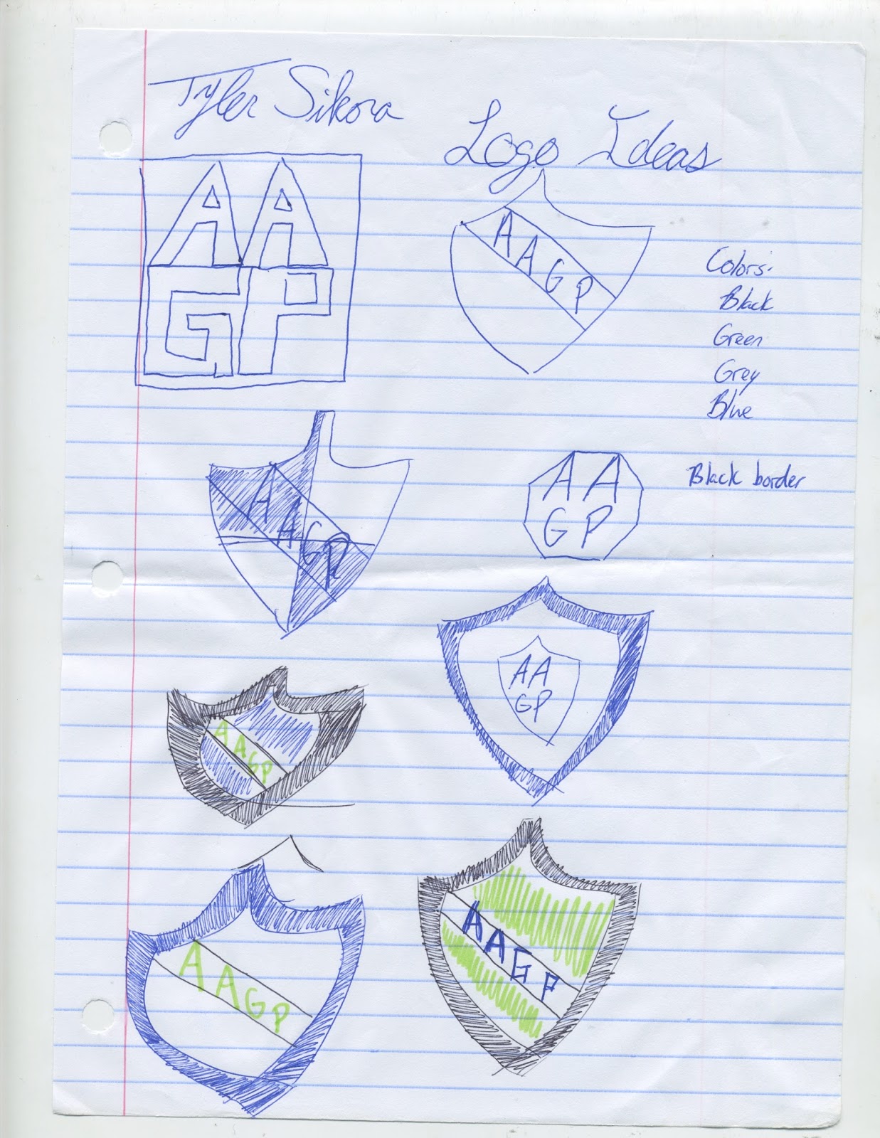
On Tuesday morning (3/21) my flash drive crashed and I lost everything on there including my project, resume and other assignments for different classes. I originally created the BMW M logo but because I lost I decided to create another one. I decided to recreate the old school Playstation logo. 

<!DOCTYPE HTML>
<html>
<head>
<script>
window.onload = function() {
var canvas = document.getElementById("myCanvas");
var context = canvas.getContext("2d");

////////////////////////////////////// start below this line ˇˇˇˇˇˇˇˇˇˇ


//middle shape
context.beginPath();
context.moveTo(300, 50);
context.quadraticCurveTo(460, 86, 500, 120);
context.quadraticCurveTo(579, 176, 545, 293);
context.quadraticCurveTo(517, 363, 445, 323);
context.lineTo(445, 148);
context.quadraticCurveTo(421, 105, 400, 130);
context.lineTo(400, 527);
context.lineTo(300, 500);
context.lineTo(300, 50);
context.closePath();
context.fill();
context.lineWidth = 4;
context.stroke();

//left shape
context.beginPath();
context.moveTo(200, 350);
context.lineTo(280, 323);
context.lineTo(280, 380);
context.lineTo(170, 425);
context.quadraticCurveTo(147, 451, 200, 448);
context.quadraticCurveTo(210, 450, 280, 423);
context.lineTo(280, 474);
context.quadraticCurveTo(227, 484, 200, 482);
context.quadraticCurveTo(74, 463, 68, 425);
context.quadraticCurveTo(53, 400, 200, 350);
context.closePath();
context.fill();
context.lineWidth = 4;
context.stroke();

//right shape
context.beginPath();
context.moveTo(420, 370);
context.quadraticCurveTo(500, 340, 600, 353);
context.quadraticCurveTo(750, 387, 650, 445);
context.lineTo(420, 525);
context.lineTo(420, 468);
context.lineTo(550, 423);
context.quadraticCurveTo(654, 384, 550, 387);
context.lineTo(420, 427);
context.lineTo(420, 370);
context.closePath();
context.fill();
context.lineWidth = 4;
context.stroke();


////////////////////////////////////// end above this line ˆˆˆˆˆˆˆˆˆˆˆˆˆˆˆ

};

</script>
</head>
<body>
<canvas id="myCanvas" width="800" height="600"></canvas>
</body>
</html>

Monday, February 27, 2017

Project 2: Illustrator Dad


I recreated an image of my father. I think my design of my father would fit in perfectly with with the characters of South Park. I made his face and I then created a frame around to make it look like a caricature. I showed it to my dad after I finished and he couldn't stop laughing. Hopefully, thats a good thing. 

Tuesday, February 7, 2017

Project 1: AAGP Logo Design

For Project 1, I created an icon for the company that I work for, All American Gutter Protection. I've thought about different ideas for the logo of the company since I started working in mid-October and a shield always came to my mind. The blue represents water and the green for leaves / debris that might end up in you gutters. 

Wednesday, January 25, 2017

Art 210: Logo Critique


I decided to compare Google and Yahoo'! email logos. I personally use gmail but I like the Yahoo! logo more. I believe both logos are appealing to the eye and you can tell the purpose of the app.

The gmail logo is strong because the M for mail creates an envelope. After seeing the logo you should automatically know that this logo is for some sort of mail. Unfortunately, because Google is not spelled out it may be difficult for some to recognize the logo. The red is extremely strong and it may be too busy for some because of it.

Yahoo! does a great job on their logo. I think the purple color is extremely appealing to the eye and I like how it starts to fade towards the bottom of the logo. I also like how identifiable it is. After looking at the logo you will know it's for mail and Yahoo owns it.
Google has created a more design appealing look because they created an envelope around a M to signify mail. While Yahoo! went a more basic route by creating an envelope and then adding Yahoo! underneath it.